Data Science Projects

I've recently become interested to explore the world of Data Science. Machine Learning, Neural Networks, Random Forest Classifiers, gathering and cleaning datasets, visualizing networks and summary data, etc. There is a lot to learn, but we seem to have only scratched the surface of what exploring data can unlock for us. I find the prospects to be very exciting!

For working directly with the data -- after getting my hands dirty trying to write some of the algorithms myself -- I've moved to relying primarily on various libraries in Python (sci-kit learn, pandas, numpy, sqlite3, matplotlib, seaborn, etc.) Python was a natural choice for me, both because I've heard how versatile it can be and because I already had some basic familiarity with it from other mathematical projects I've worked on in the past.

Below are some examples of visualization projects that I've worked on recently. For more details, click through to the follow-up page(s) or check out my GitHub page.

Racial Inequity

Using data from the U.S. Census Bureau, I have tried to analyze the relationship between race and household income in the U.S., and, perhaps unsurprisingly, it is quite inequitable for families of color.

Graph of Racial Income Inequality from 1962 to 2018

Racial Income Inequality

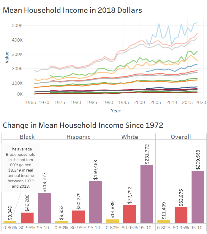
As of 2018, on average in the bottom 80% of households, Black households and Hispanic households respectively earned 41% and 27% less than their White counterparts. To put that in perspective, let's follow three hypothetical households from the bottom 80% -- one White, one Black, and one Hispanic -- as they each make the mean income for their racial group from 1972 to 2018. At the end of those 46 years (age 19 to 65 say), the Black household would be behind their White counterparts by $966,300 in total income (pre-tax measured in 2018 dollars), while the Hispanic household would be $702,257 short (and this completely ignores the greater opportunities for White workers to move up over time and the ability to invest the excess income, both of which would only further widen the disparity). If you click on the picture at left or click here), you can interact with this dashboard to explore the data further.

COVID-19 Data Analysis

Using data from The Atlantic's COVID Tracking Project, I've run analysis on the daily changes in positive COVID-19 cases.

Graph of Daily Increase in Positive COVID-19 test results

Visualization of Daily Rate of Positives

Around the world, the countries which have done the best to mitigate the spread of COVID-19 have done enough contact tracing and testing to get their daily rate of positive tests under 2%. The Tableau dashboard I've created allows the user to explore the spread of COVID-19 across the U.S. and in individual states while also seeing how the daily rate of positives in each state compares to that 2% ideal. The graph at the left is a snap shot from October 31st, 2020, but if you click on it, (or click here), you can interact with this dashboard.

arXiv Metadata

arXiv.org is an online database of preprint articles (mostly in STEM fields, especially math). Accessing the arXiv API, I created a SQL database of the article metadata (title, authors, posting date, etc.) Using that data, I have created several different kinds of visualizations.

A Coauthor Network Graph from math articles on the arXiv.

Interactive Coauthor Network Graph

Selecting the top 200 authors in mathematics (ranked by number of articles contributed to the arXiv), I've created an interactive coauthor network graph using the javascript visualization tool d3.js. The size of each node corresponds to the number of articles an author has contributed, while the thickness of each edge reflects the number of articles two authors have written together. The color of the nodes is also related to the number of distinct coauthors a contributor has. The graph at the left is just a picture, but if you click on it, (or click here), you can interact with this visualization.

A stacked area plot of the number of contributions in each category by year.

Visualizations of Category-specific Contributions

Articles submitted to the arXiv are not just sorted by field -- math, physics, computer science, etc. -- but also receive a classification based on more specific subject areas -- e.g. graph theory, combinatorics, and so on. Using the database I constructed, I've visualized the contributions to each mathematical subject area over the years in various ways. The image at the left here is one example. Click the image (or here) to see more.