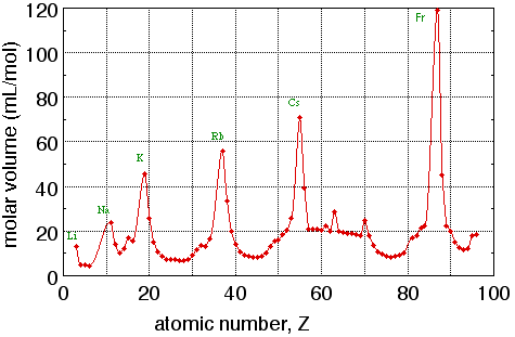
Figure 1. Graph of molar volume (mL per mole of atoms) of elemental solids vs. atomic number. Note that the peaks in this graph all belong to alkali metals.
Figure 1. Graph of molar volume (mL per mole of atoms) of elemental solids vs. atomic number. Note that the peaks in this graph all belong to alkali metals.
Figure 1 is an example of an xy graph, sometimes also called a scatter plot or a line graph. This is the most common format for plotting scientific data, as it displays the relationship between two variables. Other common graph formats include the bar graph, shown in Fig. 2 (and the closely related column graph, which uses vertical rather than horizontal bars) and the pie chart, shown in Fig. 3. Bar and column graphs are frequently used to display values of a single quantity measured for different samples when the samples differ in kind rather than in number.
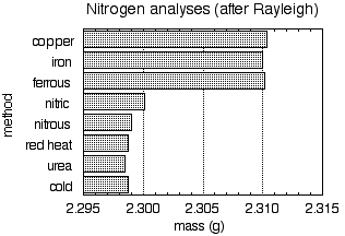
Figure 2. Mass of nitrogen, derived from various sources, contained in a standard glass globe.
Figure 2 shows the mass of nitrogen gas contained in a certain glass globe; the labels on the vertical axis denote various methods for preparing the sample. Note how just glancing at this simple chart clearly divides the samples into two sets with slightly but definitely different values.
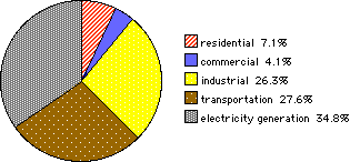
Figure 3. United States energy consumption by sector in 1999.
Figure 3 displays US energy consumption in various energy sectors as a percentage of total consumption. Pie charts are particularly well suited to display of the partition of a whole among a small number of parts.
The remainder of this exercise will concentrate on xy graphs. An xy graph is used to display the relationship between two variables. In Fig. 1, the variables are atomic number (Z) and molar volume (V). Each point on this graph represents an ordered pair of data: for each value of Z there is a corresponding value of V. Each value of Z is plotted along the horizontal axis, also called the x axis or abscissa, and the corresponding value of V is plotted along the vertical axis, also called the y axis or ordinate. Figure 4 shows how this is done with the point for the element scandium: Z = 21 and V = 15.0 mL/mol. The point is located 21 units to the right of the y axis (that is, 21 units along the x axis) and 15.0 units above the x axis (that is, 15.0 units along the y axis). The variable plotted along the x axis is called the independent variable; the variable plotted along the y axis is called the dependent variable. Before plotting the data, it is often convenient to list the data in two columns. One contains independent variable values, usually in numerical order; the other contains the corresponding dependent variable values.
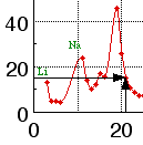
Figure 4. Plotting the point Z = 21, V = 15.0.
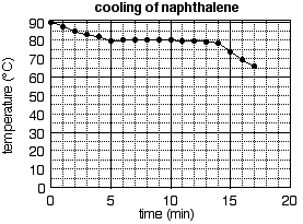
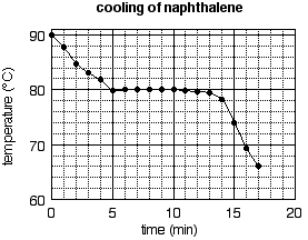
Let us construct a graph from data that one might collect in an experiment. The experiment calls for measuring the temperature of a liquid at regular time intervals as the liquid cools and eventually solidifies. (The freezing point of the liquid can be determined by such measurements, followed by careful graphical analysis.) The data are shown in the following table. (Note that the data are displayed in the way that they were most likely collected. Time is the independent variable here, for it passes independently. At one-minute intervals, the experimenter recorded the temperature, the dependent variable, corresponding to the current elapsed time.) The data are also best plotted in order: first move zero units along the x axis (that is, right on the y axis), and then 90.0 units up to plot the first point. Now go back to the origin (where the axes cross) and move 1 unit right (along the x axis) and 87.7 units up (Fig. 5a).
| time (min) | temperature (°C) |
|---|---|
| 0 | 90.0 |
| 1 | 87.7 |
| 2 | 84.8 |
| 3 | 83.1 |
| 4 | 81.8 |
| 5 | 79.8 |
| 6 | 80.0 |
| 7 | 80.1 |
| 8 | 80.1 |
| 9 | 80.1 |
| 10 | 80.1 |
| 11 | 79.8 |
| 12 | 79.7 |
| 13 | 79.4 |
| 14 | 78.3 |
| 15 | 74.0 |
| 16 | 69.3 |
| 17 | 66.0 |
The graph is completed by plotting the rest of the points in the same manner, drawing a smooth curve through the data, labeling the axes, and giving the graph a title. The complete graph is shown in Fig. 5b.
Figure 5. a) Plotting the first two points from table 1.
b) The completed graph.
Axis labels are an essential feature of an informative graph. They must list the name of the variable plotted along each axis and the units of the variable. A title is also often needed to make a graph informative. The title should not simply repeat the axis labels (as in "temperature vs. time"), but should convey some information about the system to which the graph applies. For example, "cooling of naphthalene" tells the reader about the process (cooling) and the sample (naphthalene). If a report contains several graphs involving the same variables, then graph titles are essential. For example, if Fig. 5b appeared in an experiment where several cooling curves were measured, it would be necessary to distinguish this cooling curve from others by titles (naphthalene in one title, for example, and anthracene in another; or pure naphthalene in one title and naphthalene solution in another).
Figure 5b is a well-plotted graph in every respect but one: the data are not spread over the whole surface of the graph. Setting the scale should be an early step in constructing a graph. Leave room at the bottom, left, and top of the graph for the axis labels, the numerical scales, and the title. Consider the rest of the graph paper to be the field on which you will plot your points. Count the number of large boxes along each axis. In our example, there are four boxes along the x (time) axis and three along the y (temperature) axis. Now look at the data and identify the minimum and maximum values to be plotted. The time data range from 0 to 17 minutes, the temperature data from 66.0 to 90.0 degrees. Now set the scale so as to spread the data throughout the field. How? Choose "round" numbers within which the data fit, and which is readily divisible by the number of boxes available. For example, the time data fit within the range 0 to 20 minutes, and the range of 20 minutes is readily divisible by the four available boxes, making each large box worth 5 minutes. On the y axis, the data fit within the range 60 to 90 degrees, and that range (which is 30 degrees "high") is divisible by the three available boxes. (Note: it is not necessary to for the graph to contain the point 0,0.)
In Fig. 7, the equation and the line were determined by a computer program; however, the process can be done by hand to a reasonable approximation. One first plots data points in the usual way. Then one draws a straight line "through" the data; use a straightedge or ruler to draw a line that goes near or through all the data points. Finally, determine the formula of the straight line by measuring its slope and y-intercept. The slope (m) of a line is the change in y over the change in x: m = Δy/Δx .
The y-intercept (b) is the value at which the line crosses the y axis, or, more technically, the y coordinate of the line where its x coordinate is zero. Once the slope m and the y-intercept b are known, the formula for a straight-line or linear relationship between variables x and y is simply:
y = mx + b.
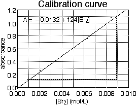
Figure 7. A calibration curve for an experiment using visible spectroscopy. The diagonal line is the best-fit straight line "through" the data, and the equation is the formula for that line. Bold dashed lines are guide lines for measuring the slope.
In Fig. 7, measure the slope of the line. To do this, pick two points on the line (note: not two experimental points, but points on the line; after all, the line is determined by all of the experimental points, so it uses all of the data). In principle, it does not matter which points on the line you choose, but as a practical matter, it is convenient to choose points that pass through or near grid lines. Also, points far apart on the line will yield a more precise slope than points close together. Figure 7 is marked with bold dashed lines to help us find the slope based on a point in the upper right and one in the lower left of the best-fit line. The difference in y coordinates is 1.11 - 0.10 = 1.01 absorbance units, and the difference in x coordinates is 0.0090 - 0.0010 = 0.0080 mol/L, so the slope is:
m = Δy/Δx = 1.01/(0.0080 mol/L) = 126 L/mol .Note that the slope has units that depend on the units of the graph axes. In order to find the y intercept, extend the best-fit straight line to the y axis if it does not already cross it. Note that the line does not quite go through the origin; rather it crosses the y axis at about 0.1 units below zero. So the y-intercept is b = -0.1. (Note: b has the same units as the y axis, in this example it is a pure number.) So the formula of this best-fit line is:
y = (126 L/mol)x - 0.1 .Finally, using symbols more expressive of our real variables (absorbance and molarity rather than generic x and y), we write:
A = (126 L/mol)[Br2] - 0.1 ,very close indeed to the computer-generated equation.
Sometimes finding the slope or intercept of the best-fit line is an object of the experiment because the slope is physically significant. Other times, the best-fit equation will be useful for further data analysis. For example, the equation derived from fig. 7 could be solved for bromine molarities:
[Br2] = (A + 0.1)/(126 L/mol) .This would be a useful formula to determine the molarities of unknown solutions by measuring their absorbances.
 or landscape
  orientation.) Leave room under the x axis for its numerical scale and the x-axis label; leave room to the left of the y axis for its numerical scale and the y-axis label. Leave some room at the top for a graph title.
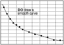
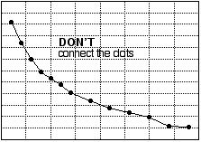
How best to represent plotted data with a line or curve depends on several circumstances, including the precision of the data points and known or theoretical relationships between the variables. It is usually good practice to draw a smooth curve "through" the data (that is, through or near the plotted points). In the experiments we carry out in introductory chemistry, the equipment, techniques, and skills we use are usually not sufficiently accurate to demand that the curve pass literally through every data point; therefore, a graph that joins the experimental points (connecting the dots) is not a good one. In particular, do not connect the dots by straight line segments. (See fig. 8.) Sometimes, the experiment involves plotting variables that ought to be related by a straight-line equation. If so, the "curve" that ought to be drawn is the best straight line that goes through or near the data.
 Back to the Chemical Principles Lab Schedule.